The Visual Design of Shelf Life
Shelf Life is a short film set in a world of storybook warmth and philosophical absurdity, where bread develops emotional awareness and still has to be eaten. The film's visual identity makes that premise feel tender rather than horrific, cozy rather than strange.
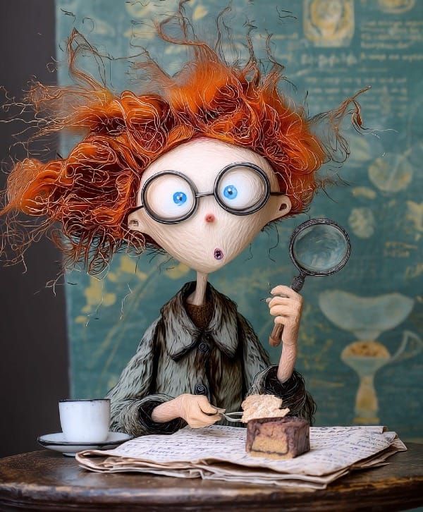
Every frame was generated in Midjourney using a proprietary moodboard and visual reference system developed over months of iteration. The aesthetic draws from handcrafted illustration traditions: soft ink outlines, watercolor textures, warm natural lighting. The world of cobblestone streets, warm bakeries bathed in beautiful light.
Shelf Life introduces its cast through freeze-frame overlays: "BAXTER CARROTCRUMB - DELIVERY DRIVER." "TILDA CRUMB - FOOD CRITIC (AMATEUR)." It was the solution to a problem of how to orient a cold audience in a world this strange without stopping to explain it. The documentary style elevates the absurd premise pushing it over the top, which is exactly when absurdism works.
Shelf Life exists within the larger Crumb Canvas universe, a transmedia storytelling project spanning short film, written fiction, and serialized content. The visual language of the film was developed alongside that broader world, ensuring continuity across mediums while allowing the film to stand entirely on its own for audiences encountering it for the first time.
The result is a film that looks like a page torn from a storybook you can't quite place, warm enough to trust, strange enough to unsettle, and deliberate in every frame.